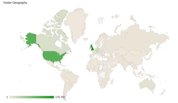
This map shows a comparison of visitors to our websites by country since the start of the year. The darker the country is on the map, the more visitors we have had from there. The UK and the United States are by far the most common with over 100,000 each, but we have had visitors from almost every country on the face of the planet. We’ve even had one visit from someone in the world’s youngest country, South Sudan!
We are always working on new ways to bring citizen science to all citizens of Earth, and hopefully this map will continue to fill up.


Comments are closed.